


I remember writing articles in 2022 about the signs that it was time to update your website: pages that loaded slowly, a site that fell apart on a phone, a design that looked dated. Most of that still holds. But a whole lot has changed since then.
Anyone can now get a decent-looking website in an afternoon, from a template or an AI builder. Decent is free now, so the bar has been raised. The risk is no longer a website that looks old. It is a website that looks like everyone else's, and that is no reason to pick you. This post is about what does make a website stand out going into 2027: what I see on the sites I admire, what I do for clients, and what I would skip. If you only want the short version, the checklist is at the end.
Why standing out matters more now
Generic got cheap
Templates and AI tools are built from what already exists. That is useful, and I use AI in my own process. But the result drifts toward the average: the same soft gradient, the same three cards in a row, the same "Elevate your business" headline. When every competitor can produce that in an hour, it tells a visitor nothing about you.
Playing it safe has quietly become the risky choice. Stuart Ross of OFF+BRAND, the studio behind Lando Norris's website, makes the same point: sites designed to get through internal approval end up interchangeable, and AI summaries flatten markets even further (Prismic blog). In his words, "Playing it safe is no longer safe."
Fewer clicks, so every visit counts
Search sends fewer people to websites than it used to. In a 2025 study, Pew Research Center found that Google users clicked a regular search result in 8% of visits when an AI summary appeared, against 15% when there was none (Pew Research Center).
The people who do arrive often already know your name. Someone recommended you, an AI answer mentioned you, or they got your link in an email. They come to check whether you are the real deal, and your website has a few seconds to confirm it. That is where the decision gets made.
What a high-end website does now
Look at the sites that win awards this year and the bar is obvious. It is not dark mode and a big font any more. It is micro-interactions on every hover and click, sound that reacts to what you do, WebGL shaders and real-time 3D, scroll-driven scenes, and page transitions that make the whole site feel like one continuous piece. Every detail is designed, down to the cursor.
Lando Norris's site, built by OFF+BRAND, is a good example: move your cursor over his face and the 3D helmet appears in pieces under it. Add custom easing on every text effect and a 3D race track, and you have a site people send to each other. It was an Awwwards Site of the Day in November 2025, and Wes Bos called it "full of cutting edge web stuff" when he argued that 2026 is the year design makes a comeback (RedMonk).
I collect sites like this every year in my list of the best websites. You don't need a 3D helmet to stand out, and copying one won't make you different either. But this level of care is what people now see elsewhere, so it is quietly what your site gets compared to. The ten ways below are how I bring that same care into a site on a normal budget.
Signs your website is holding you back
Before you work on standing out, check that nothing is pulling you down. These are the signs from those 2022 articles that still matter, updated for how people use the web now.
- You hesitate to share your URL. If you would rather send a PDF or point people to your Instagram, your website is not doing its job.
- It could belong to a competitor. Cover your logo and read your homepage. If you could swap in a competitor's name and nothing would feel wrong, you are invisible. Pedro Sostre uses the same test in a recent Entrepreneur column.
- It looks AI-made. The tells are easy to spot once you know them: one default font everywhere, a purple-to-blue gradient, a vague headline like "Build the future of work", glossy AI illustrations, the same spacing and rounded corners on every card, and the same fade-in on everything. 925Studios lists these in its guide to AI slop in web design.
- It says what you do, not why someone should pick you. A list of services is not a reason to choose you.
- Visitors can't see the next step. Every page needs one clear action, whether that is booking a call, sending a message or seeing the work.
- It is slow or clumsy on a phone. Many people meet you on their phone first, often on a bad connection.
- You can't change a sentence without calling someone. If every small update needs a developer, your site goes stale.
- It doesn't work for everyone. Low contrast, tiny text, no keyboard support and missing alt text shut people out.
- People see you but don't act. Search Console shows impressions but few clicks, or your analytics show visitors leaving without doing anything. A free heatmap tool like Microsoft Clarity shows where they scroll, click and give up.
If three or more of these sound familiar, a few tweaks probably won't be enough.
Ten ways to make your website stand out in 2027
1. Know what you stand for before you design anything
A website can only be as distinct as what it has to say. If your positioning is "quality, service and a personal approach", no font or animation will save it, because every competitor says the same thing. I always start with brand strategy: who it is for, what you promise, and why someone should choose you over the next option. I wrote the whole process down in How to Build a Brand That Stands Out.
2. Write like a person
Copy is the cheapest way to stand out and the most overlooked. Generic sites all sound alike: "innovative solutions", "tailored to your needs". Say who you help and what changes for them, in the words your clients use when they call you.
Your first screen should answer three questions: what is this, is it for me, and what do I do next. If AI helps you write a first draft, fine. Then rewrite it until it sounds like you and contains something only you could say: a real opinion, a detail from your own work, a story from a client.
3. Pick one signature detail
The sites I remember usually have one thing I describe to other people afterwards. ToyFight uses sound so every click feels playful. Hello Monday has an animated favicon and one of the best menus I have seen. Headspace has its own characters and colours that you recognise in a second.
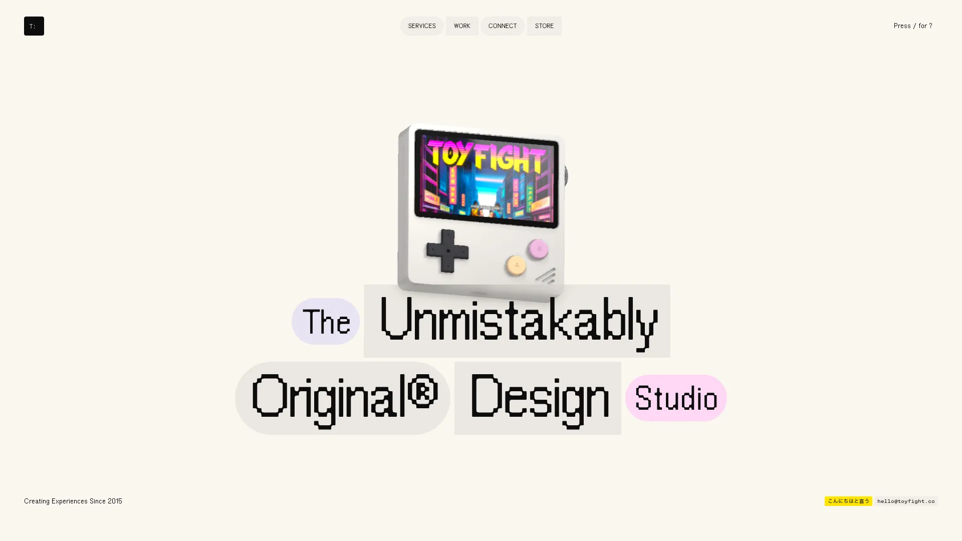
None of them try every trick at once. They do one thing so well that it becomes theirs. For your site that could be an illustration style, a custom cursor, a sound, the way pages transition, or simply a bold colour nobody in your industry dares to use. One is enough. Ten turns into noise.
4. Show the work instead of describing it
Stock photos and claims like "award-winning team" are what everyone has. Your real work is the one thing nobody can copy. Ashfall Studio is a good example: their project pages show the work, the process and the details, so you barely need to read to understand what they do. It is a standard I hold my own case studies to.
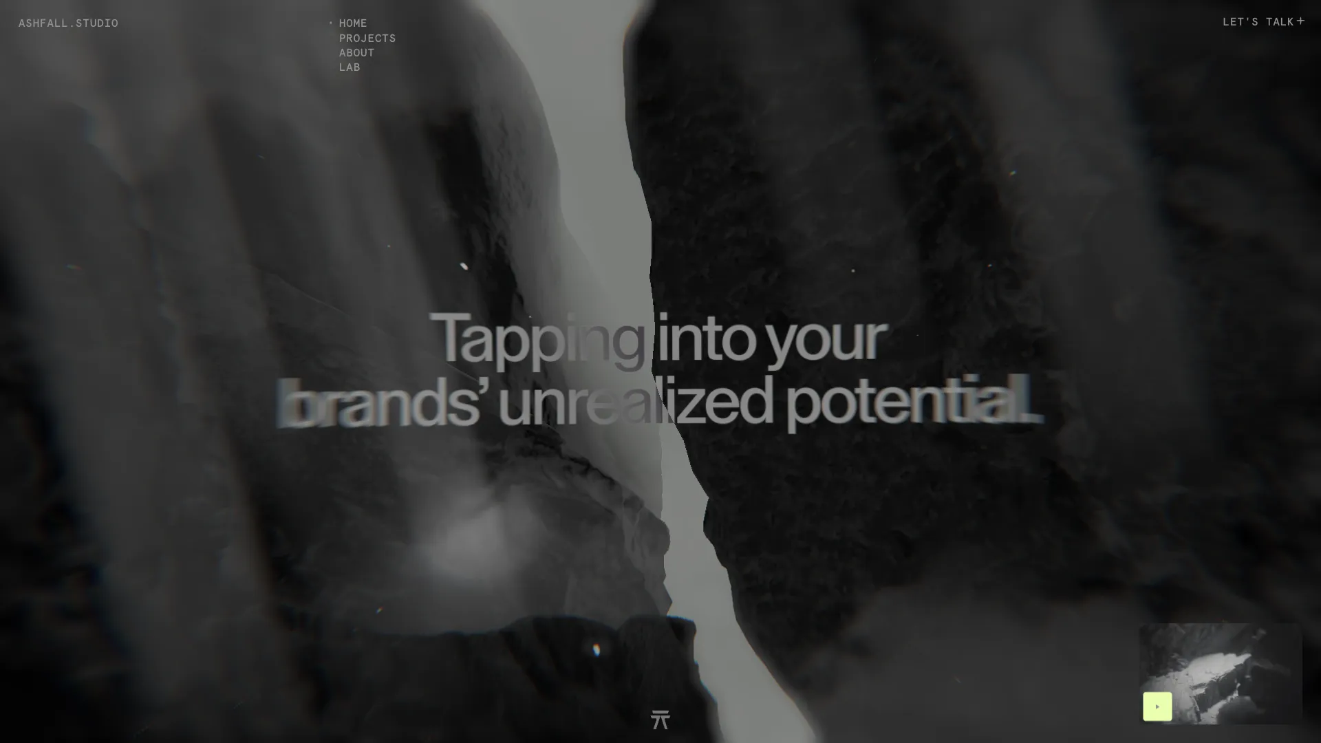
Use real photos of your team and your place, case studies with the problem, the process and the result, and reviews with real names. Proof beats promises.
5. Use motion to explain, not to show off
Motion is where I spend a lot of my time, because good animation makes a site feel alive. Lusion and Dennis Snellenberg's portfolio are a joy to scroll through. But motion has a cost. I love the design of Raycast's site, and it still took me a while to understand what the product does. When an animation delays the message, it works against you.
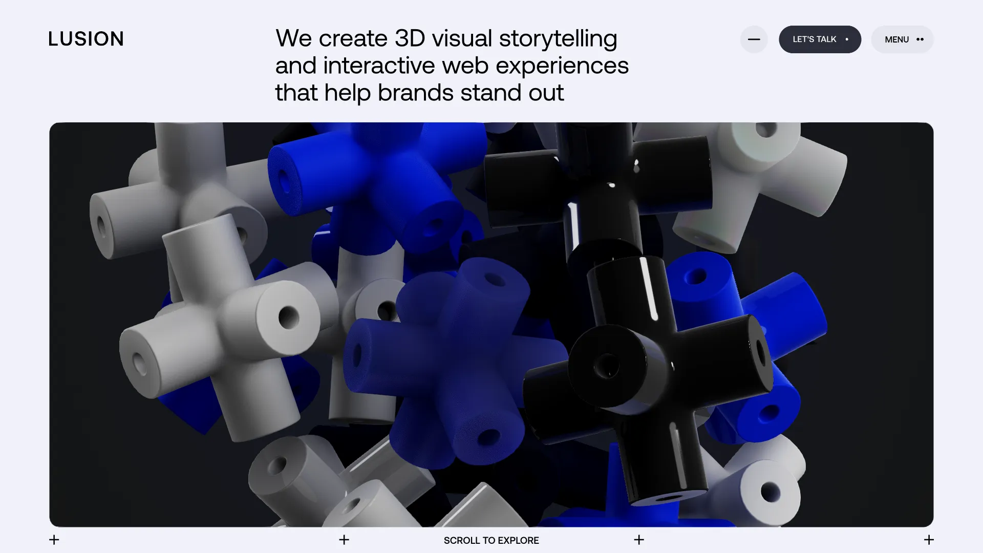
My rules: motion should guide the eye, explain something or reward an action. It should never hide content or make someone wait. And respect people who have turned on reduced motion in their system settings. Your site should still work and look good for them.
6. Make speed part of the design
A fast site feels premium. Primary is a good example: clear, clean and quick. Speed is as much a design decision as a technical one: fewer font files, compressed images in WebP or AVIF, video only where it earns its place, and no pile of plugins.
Google measures this with Core Web Vitals. A good score means the main content loads within 2.5 seconds and the page responds to a tap or click within 200 milliseconds (web.dev). Check your own site in PageSpeed Insights and start with the biggest issue it reports.
7. Build it accessible from day one
A site that works for everyone feels better for everyone. For more businesses it is now also the law. The European Accessibility Act has applied since 28 June 2025 and covers services such as online shops, banking and transport sold to consumers in the EU. Microenterprises that provide services are exempt (Directive (EU) 2019/882), so check whether it applies to you.
Even if it doesn't, the basics cost little when you plan them from the start: enough colour contrast, readable text sizes, everything usable with a keyboard, visible focus states, real alt text and headings in a logical order.
8. Be the source people and AI can quote
Search engines and AI assistants pull from pages that clearly answer a question. Google's own guide to its AI features says the thing that matters most over time is content people find unique, engaging and helpful, and that you don't need special files like llms.txt or AI-specific markup (Google Search Central).
In practice: one clear page per service, real answers to the questions your clients ask, the same name, address and contact details everywhere, and a Google Business Profile if you work locally. I explain the basics in Kick Off Your SEO Journey.
9. Make it easy to keep alive
A site that stands out at launch and hasn't changed in two years stops standing out. New projects, new reviews and a fresh case study keep it alive, and you will only add them if it is easy. That is a big reason I build in Webflow: my clients edit text, add projects and publish without calling me. If you are choosing a platform, I compared the two I get asked about most in WordPress vs Webflow.
10. Plan what happens after the first visit
Most people don't hire you on their first visit. They look around, leave, and come back weeks later, if they remember you. Sostre calls the website the front door, not the whole business, and points out that a lone "contact us" form gives people no way to stay in touch until they are ready (Entrepreneur).
Give visitors a smaller step than "contact me": a newsletter you would want to read yourself, a useful guide, a short free call you can book straight from the page, or simply a social account worth following. Then keep showing up with something useful.
What I would skip
- Copying a site you love. Take the principle, not the look. A copy of an award winner is still a copy.
- Every trend at once. 3D, oversized type, parallax and a custom cursor on one page cancel each other out.
- Effects that only work on a big screen. Test on a phone first, then on a laptop, then on the big monitor.
- A pop-up the moment someone arrives. Let people see who you are before you ask for their email.
- Launch and forget. Plan who updates the site, and how often, before it goes live.
Questions I get asked
Do I need a full redesign to stand out?
Not always. If the structure works, sharper copy, real photos and one signature detail can change a lot. If several of the signs above apply, especially the ones about your message, start with strategy and then redesign.
Can't I just let AI build my website?
You can, and for a first version it might be fine. But it will look like the average, because that is what it is built to produce. Use AI for speed, and spend your own time on what it can't make for you: your position, your voice and your proof.
How long does a website last?
In my experience a well-built site lasts years if you keep adding to it. The design usually starts to feel tired before the technology does. Run through the signs above once a year and you will know when it is time.
Where to start
- Cover your logo and check whether your homepage could belong to a competitor.
- Write one sentence on why a client should pick you over the next option, and put it on your homepage.
- Swap stock photos for real ones and add one case study with a clear result.
- Run your homepage through PageSpeed Insights and fix the biggest issue.
- Try your site with only a keyboard and check your colour contrast.
- Choose one signature detail that fits your brand.
- Give visitors one way to stay in touch besides the contact form.
Standing out is not about being louder. It is about being clearly you, and making that easy to see. If you want help with that, have a look at how I work or get in touch.
Branding
Brilliance
Sign up for your monthly dose of Branding Brilliance. Keep your brand sharp, your site smarter, and your strategy one step ahead.


Transform Your Online Presence!
Explore insightful articles in which I share my expert insights on Branding, UI/UX Design, and Online Marketing.

